
Toko
Product branding for a premium cannabis company in Portland, Oregon.
Background
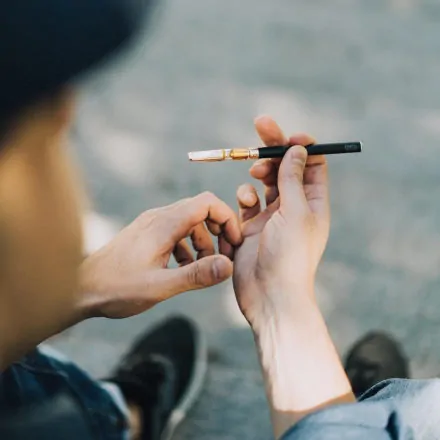
One of the more interesting branding challenges today involves navigating the new world of legal medical and recreational marijuana. OVO’s client, Sweet Cannabis, is on the forefront of that new frontier. Their premium vaporization product, Toko Gold, needed a sophisticated packaging solution that was both elegant and functional and OVO heeded the call.
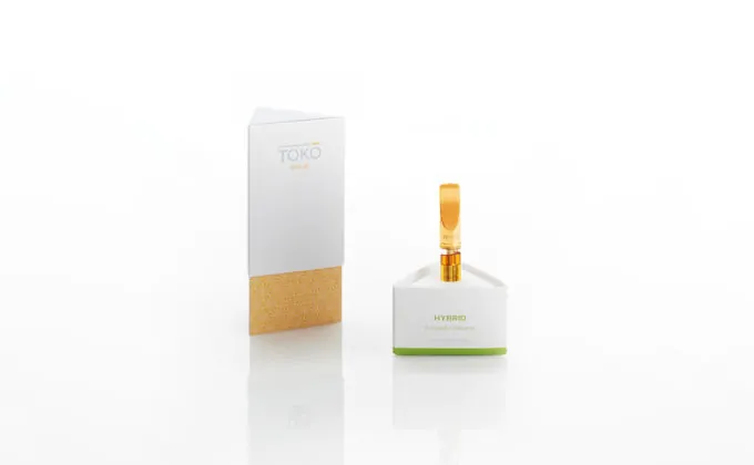
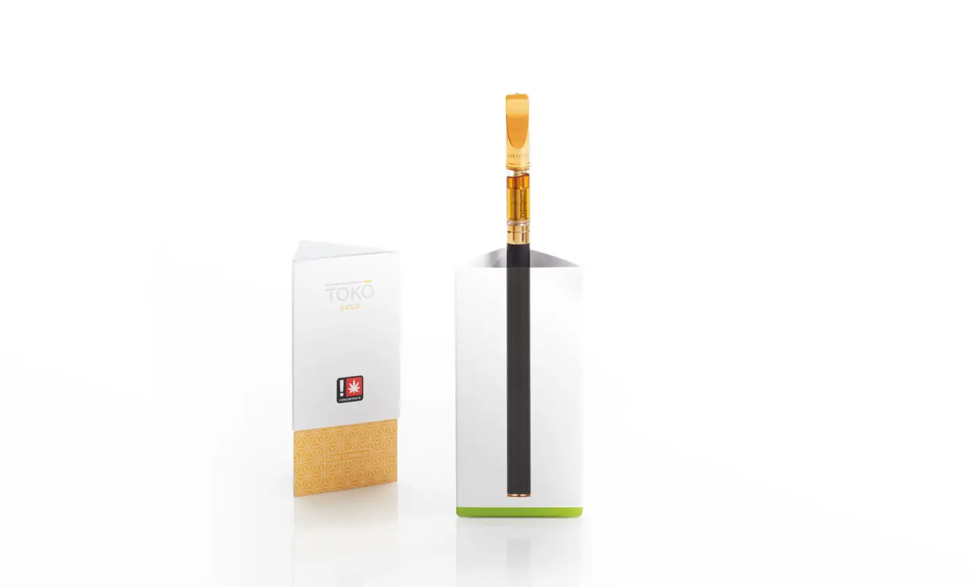 Toko Gold Product Packaging
 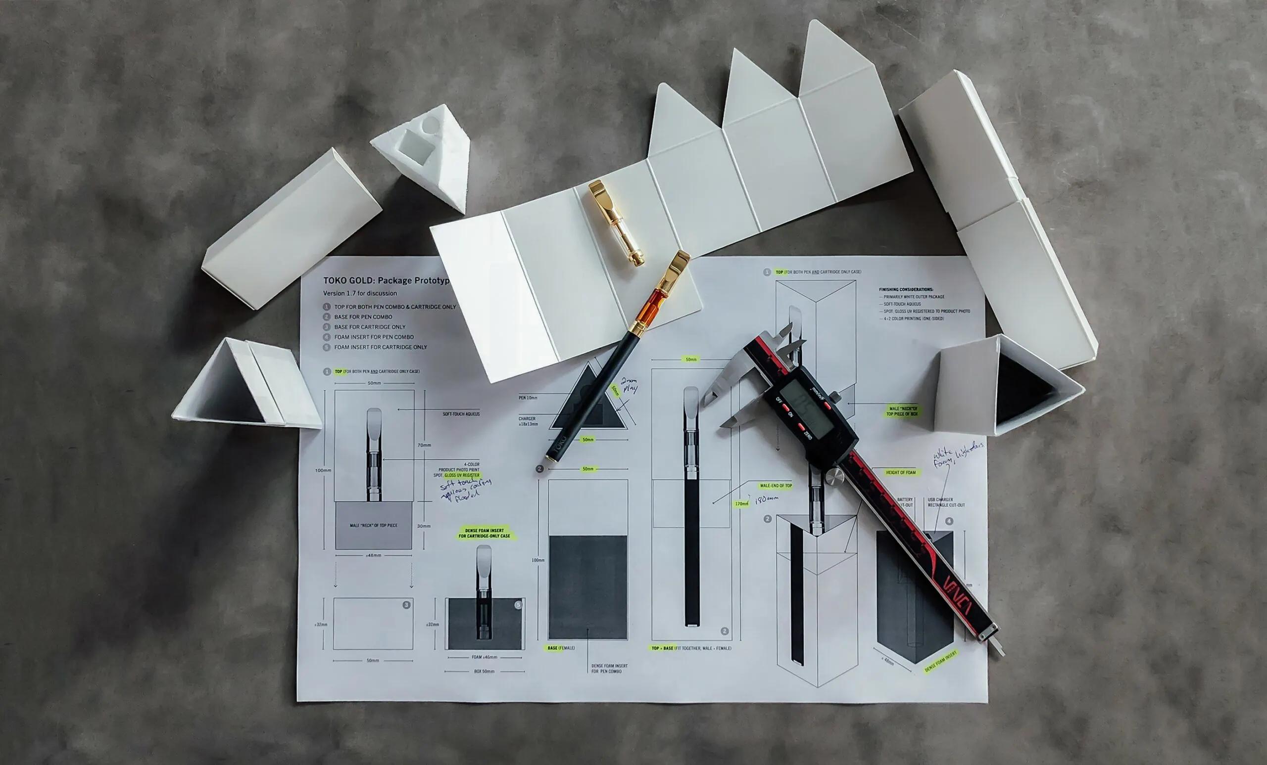 Packaging Design Process
 OVO began the discovery process by learning about the differentiators of Toko Gold and assessing the challenges of display and sale in the retail environment. While this market has briskly matured, there remains an influence of psychodelia in the visual and verbal vocabulary among competitors. Toko’s position is considerably more upscale. Think Apple meets Cartier (but without the stuffiness).
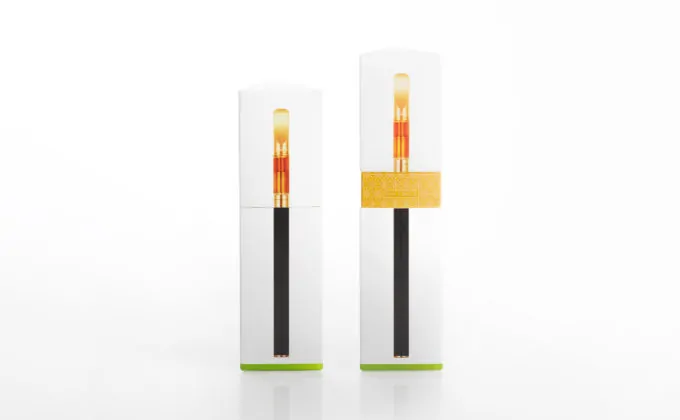
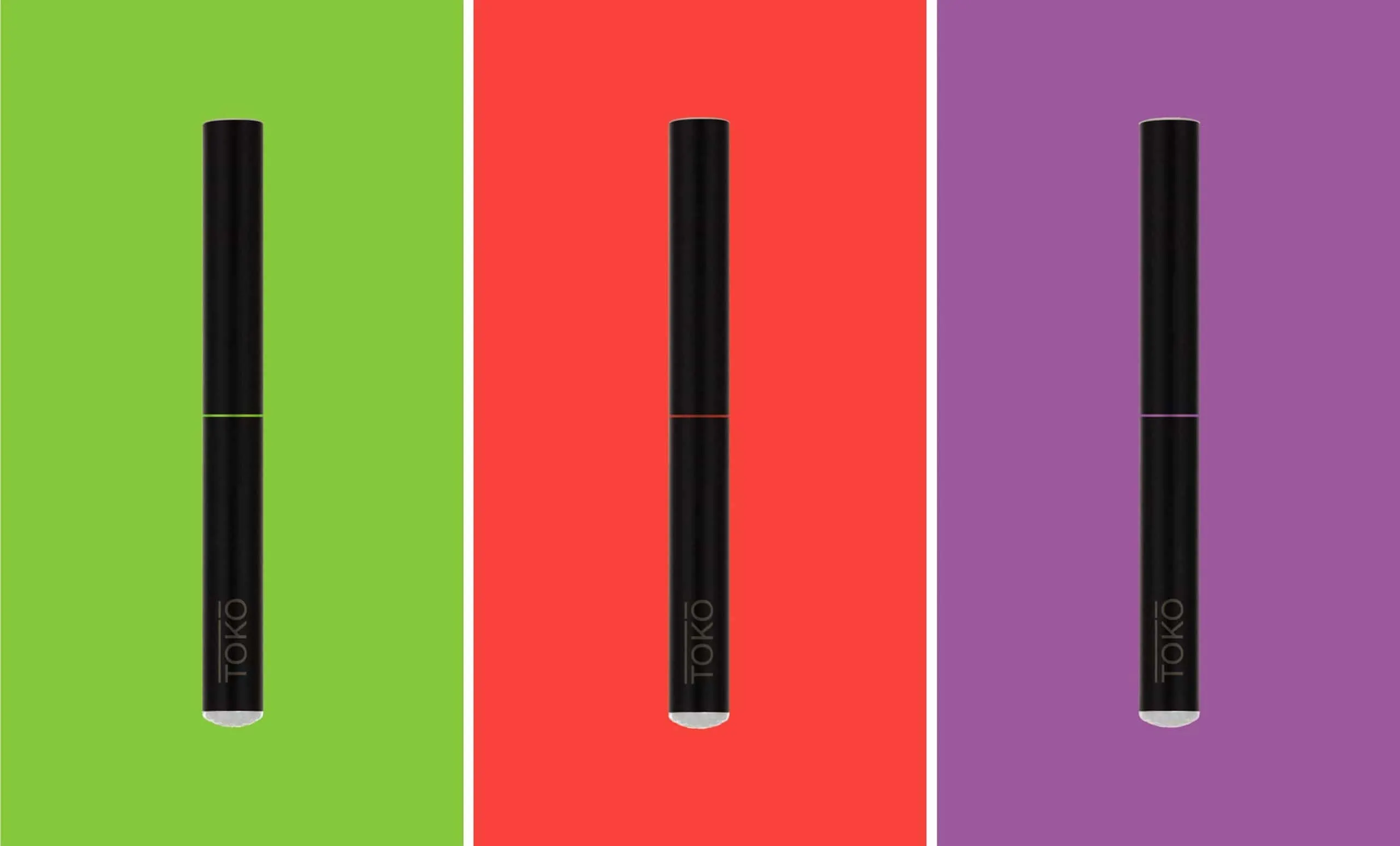 Toko Slim Design


 Brand Pattern
 The resulting approach was a refined and modern solution to type and color with a package designed to showcase product when displayed open, closed, vertical or placed on its side. To date, the response has been outstanding. Sales are strong and Sweet Cannabis (and Toko Gold) continues to define the standard.
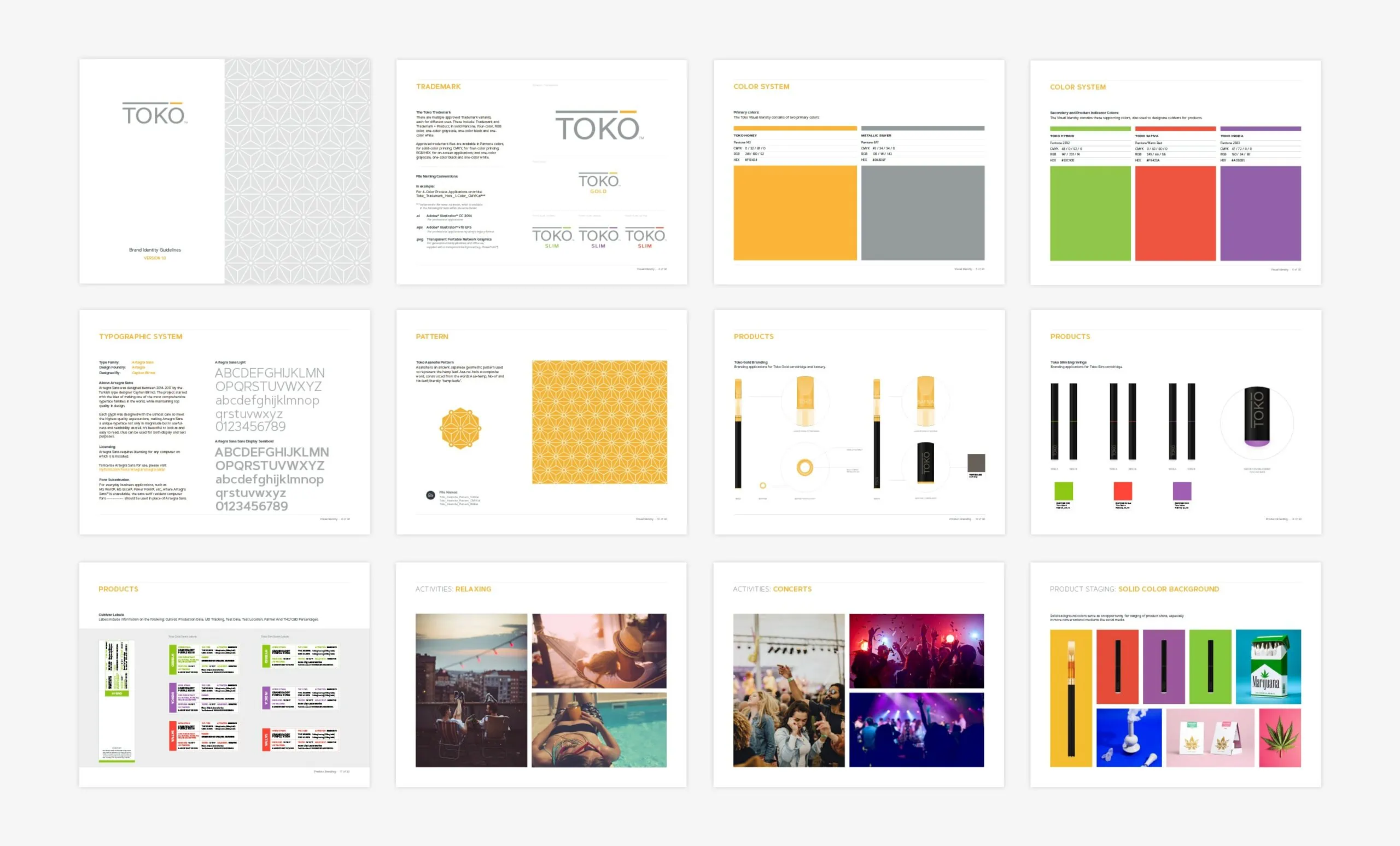 Brand Guidelines
 Additional Branding Projects

Campari + Imbibe and the making of a perfect Negroni Week experience.

Naming and rebranding a premier Northwest practice.