Akana
A new brand following the merger of two Native American-owned firms.
Background
Akana is a Native American-owned professional services firm helping clients throughout North America plan, design, engineer and manage projects in the built environment. They serve a diverse client base that includes federal, state and local agencies, Native American tribes, and the commercial and industrial sectors. Akana is the outcome of a merger between two companies—Cooper Zietz Engineers and Cascade Design Professionals. Two cultures. Two headquarters. Two sets of protocols. To move forward, Akana sought to find and express a shared sense of identity.
 Brand Photography: Herb Fricke, Akana President
 Solution
OVO was selected to provide company branding as the result of the merger. Our chief directive was to influence culture and to assist in shaping organizational change. The most visible outcomes of our efforts would be a new name, image and guidelines for implementation. The process for getting there was unique. To honor the leadership and traditions of Akana, we began with a dedicated internal research project. We sought stories from individuals throughout Akana’s dispersed workforce. Points of confluence were identified as were those of divergence.
After all voices had been heard, we guided Akana through a series of brand-related recommendations for both operations and communications, and sought consensus around those recommendations. A thorough naming process was conducted—resulting in Akana—derived from the Northern Plains Arikara Indian words akana’u (to build) and akaanu’ (lodge). A clear descriptive statement was written to accompany it and to reinforce service areas that span multiple disciplines.
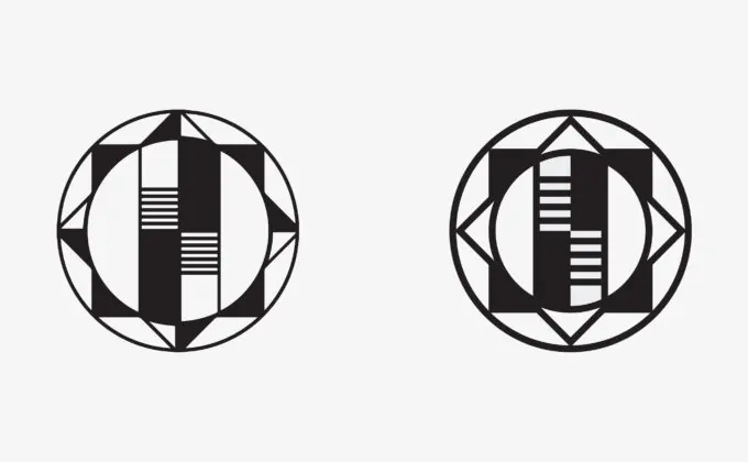 Redrawn Akana Symbol (old on left; new on right)
 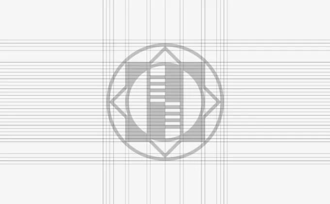 Akana Symbol Grid
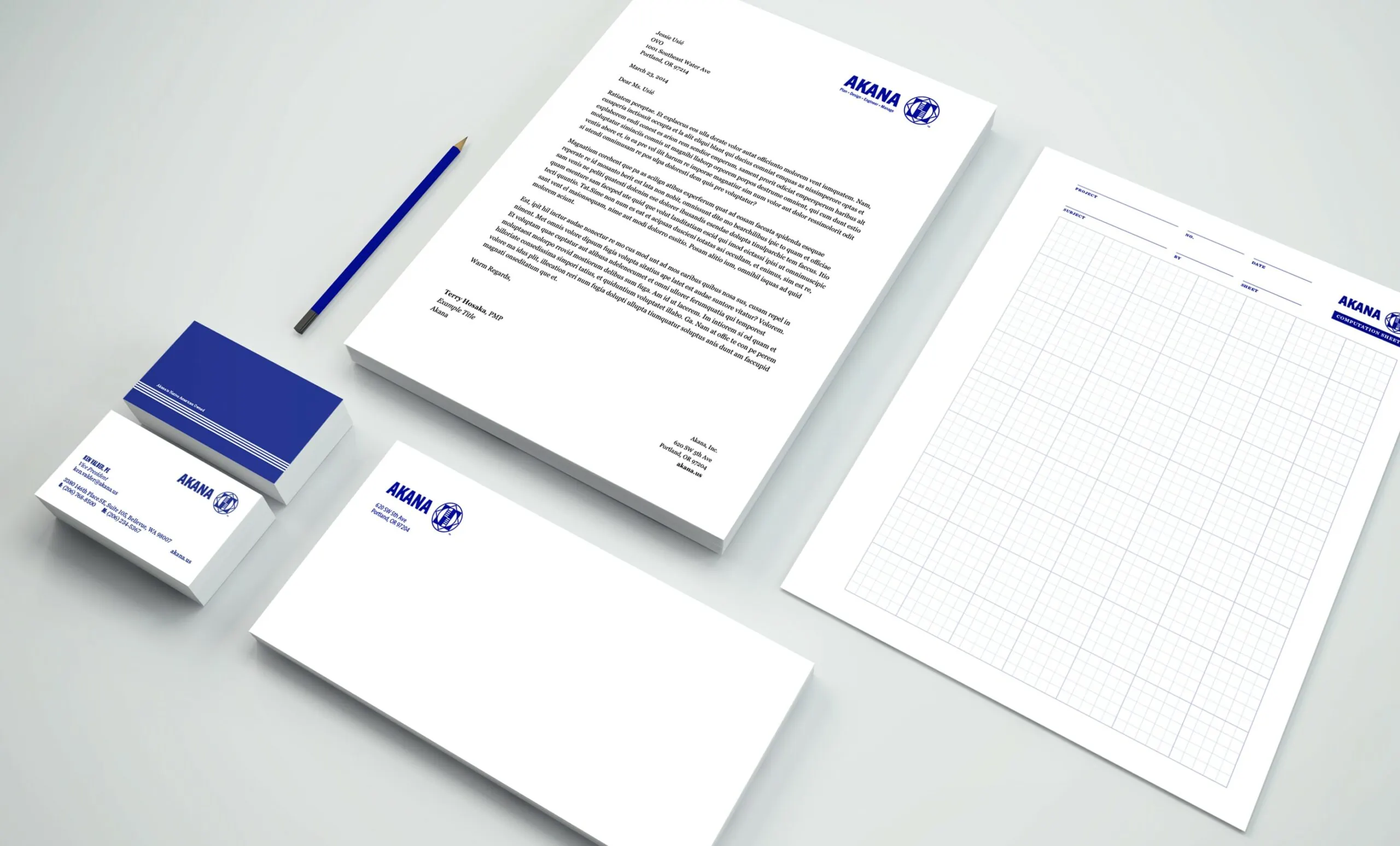
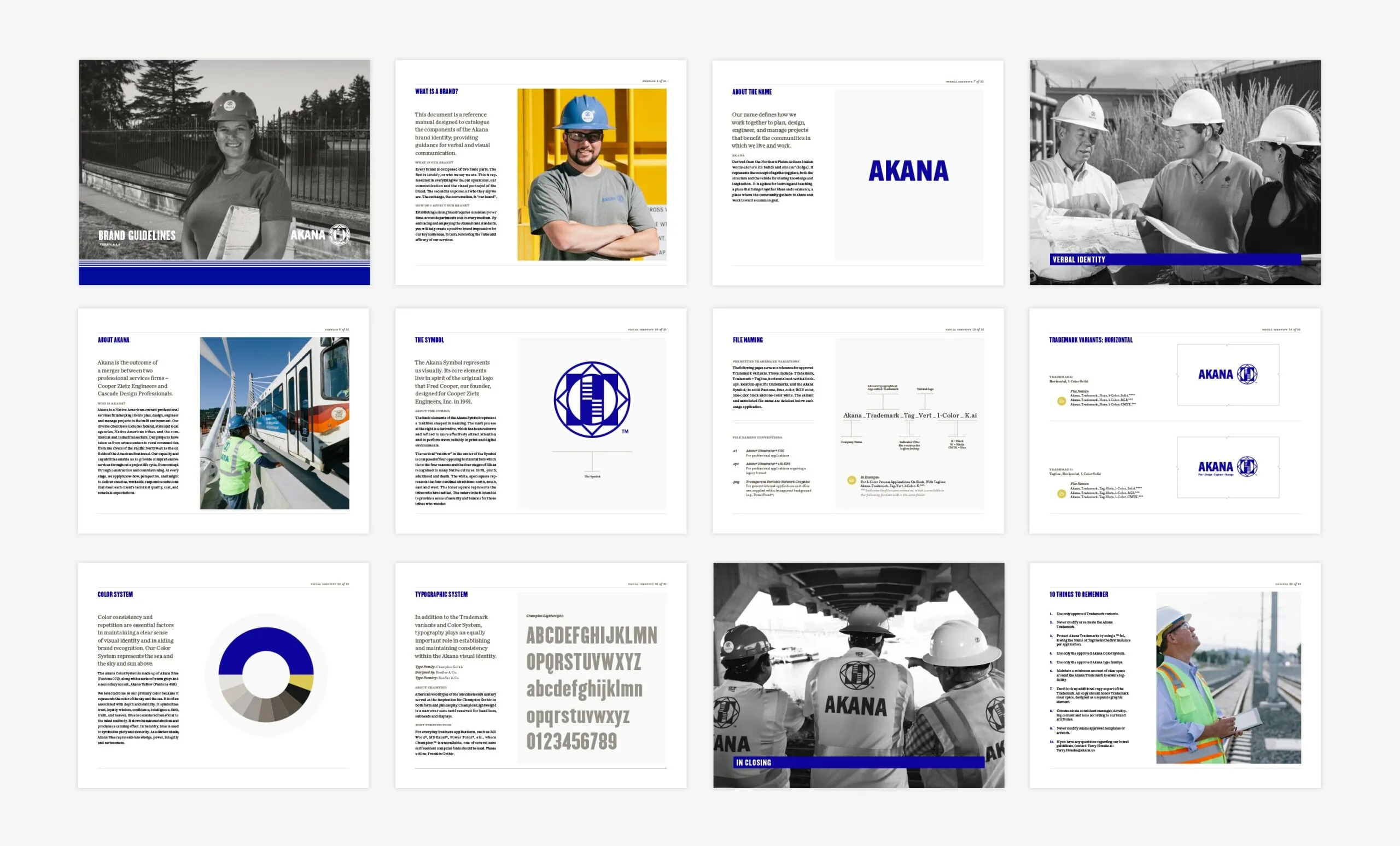 Brand Guidelines
 The Akana symbol was redrawn and refined from the core elements of the original logo that Fred Cooper designed for Cooper Zietz Engineers in 1991. The vertical “rainbow” in the center of the Symbol is composed of four opposing horizontal bars which tie to the four seasons and the four stages of life as recognized in many Native cultures: birth, youth, adulthood and death. The white, open square represents the four cardinal directions: north, south, east and west. The inner square represents the tribes who have settled. The outer circle is intended to provide a sense of security and balance for those tribes who wander.
The accompanying visual system was comprised of many elements. A pattern, considered and developed in the tradition of Native American textiles, was designed with the primary visual element an intersection—symbolising the coming together of two companies. A suite of photography was captured to showcase the people and projects of Akana. A collection of document templates and tools were developed to aid in development of proposals and in daily correspondence throughout the organization.
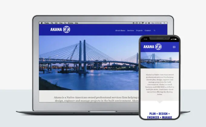 Website Home Page
 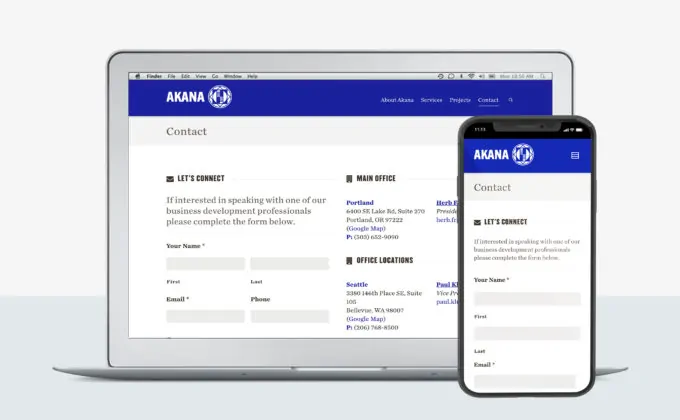 Website Contact Page
  Brand Pattern
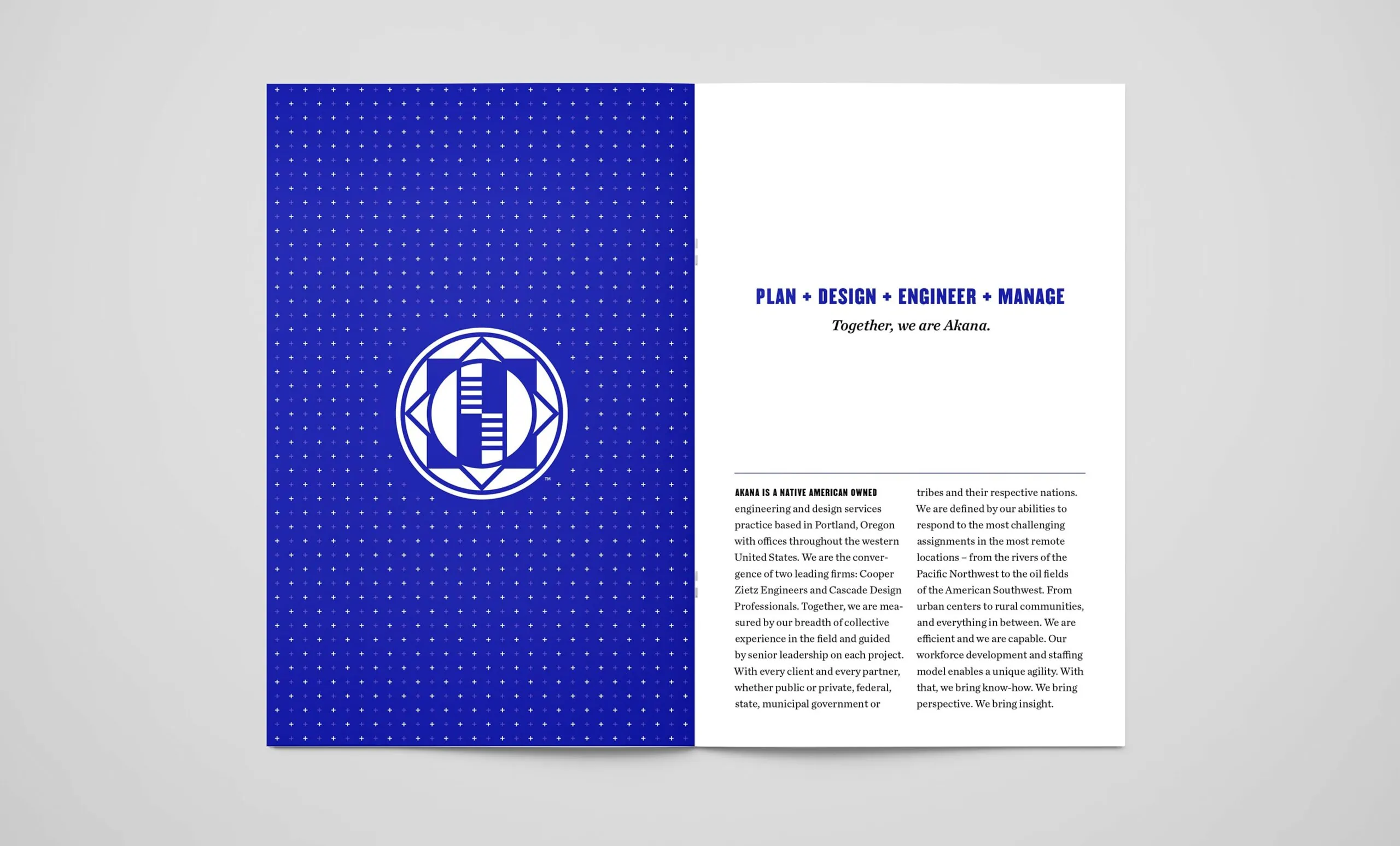
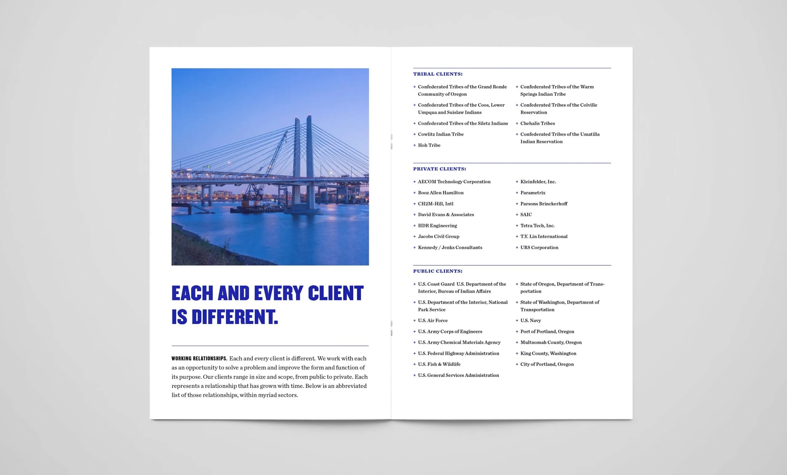 Overview Brochure
  Brand Photography