Life Flight Network
Research, strategy and rebranding for this non-profit air medical provider.
Background
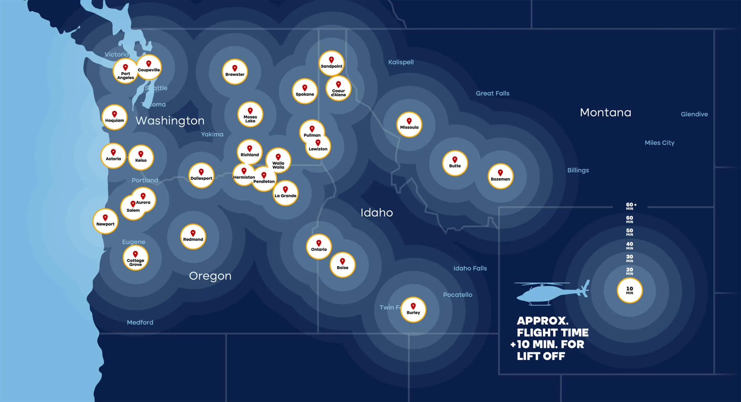
If you live in, or love to explore anywhere in the scenic northwest, you’re probably familiar with Life Flight Network. Serving local communities since 1978, Life Flight Network is the largest not-for-profit air medical provider in the U.S. and serves as a literal lifeline to emergent care for those in the most remote areas of Oregon, Washington, Idaho, and Montana. At OVO, we are constantly in awe of what they do (and how they do it) and are infinitely proud to serve as their long-term strategic brand partner.
As with so many clients, our engagement with Life Flight Network began with a comprehensive audit of their brand efforts, supported by quantitative research studies and multiple in-depth qualitative interviews. It was essential to understand the key perceptions among communities and how those insights would guide brand strategy, messaging, and positioning.
Work Performed
- Brand Archetypes
- Brand Attributes
- Brand Audit
- Brand Discovery
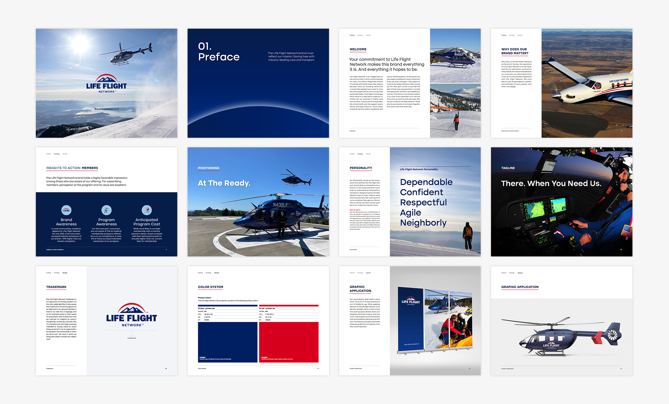
- Brand Guidelines
- Brand Identity
- Brand Maintenance
- Brand Management
- Brand Photography
- Brand Positioning
- Brand Strategy
- Brand Training and Tools
- Collateral
- Implementation Planning
- In-Person Interviews
- Launch Campaign
- Logo Design
- Messaging
- Ongoing Support
- Qualitative Research
- Quantitative Research
- Research Analysis
- Tradeshow Design
- Video
- Visual Identity System
- Website
Defining a Strategy Based in Projectable Data
At their core, our quantitative and qualitative research efforts set out to answer one key question: What matters most to first responders and hospital teams when selecting an air medical provider for patient transport?
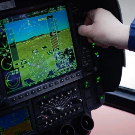
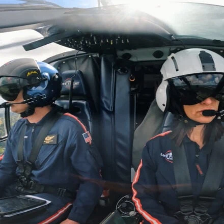
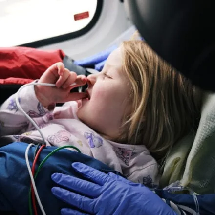
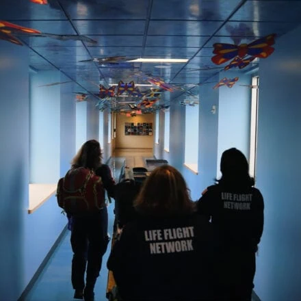
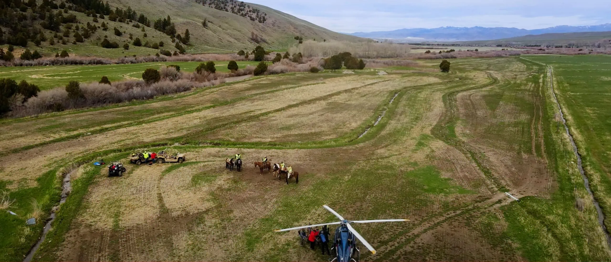 Brand Photography
 Solution
The resulting understanding would reveal a path for not only clarifying the primary messages customers needed to hear, but also their order of priority. It would also shape our brand strategy as the composite building blocks for composing the Life Flight Network brand identity. All by defining the foundational pillars of the brand, the attributes that make up its outward-facing personality, the rallying cry that defined its position relative to the competition. “At The Ready” conveyed preparedness at every level and spoke to unequaled availability and proximity. Most importantly, it underscored Life Flight Network‘s strategic initiatives: its strategically-located bases, best-in-industry aircraft, and the excellent clinical care for which it’s known.
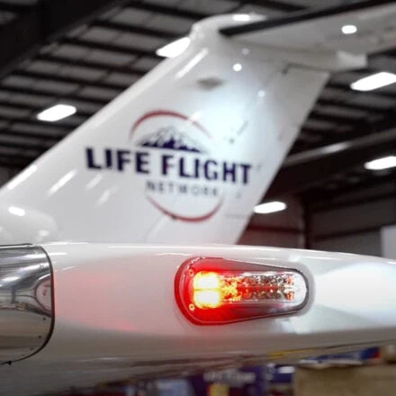
The strategy work would eventually lead to a redesign of the trademark and all supporting components within the visual identity system—from vehicle and aircraft graphics to the website and online properties, brand guidelines, and the directing and production of an expansive full-motion explainer film.
Refining a Visual Identity System In Flight
The key that unlocks any successful visual identity program is a functionality based on immaculate form. For Life Flight Network, visibility and recognition in the air and on the ground were imperatives. The previous trademark had built equity, but it didn’t perform with the precision of the organization or the skill of its people. Moreover, it needed to convey the attributes defining the Life Flight Network personality: Dependability, Confidence, Respect, Agility, and a Neighborly demeanor.
The OVO design team simplified the illustrative and typographic elements. By removing the lower red swash behind the mountain, the upper element maintained its dynamic, connective motion and formed a more recognizable “sun” while facilitating larger, bolder lettering in the name. The mountain would also be redrawn as a more open and recognizable form. When reversed (as shown below), the strong letterforms and refined mountain vista performs beautifully positioned over photos or patterns. The new trademark elevates every other component at work in the visual system.
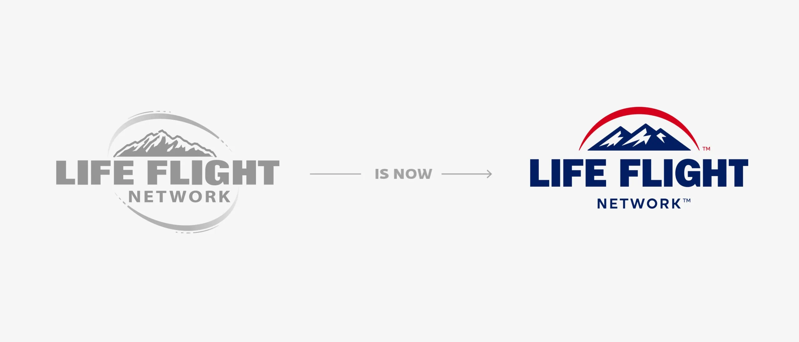 Trademark evolution
 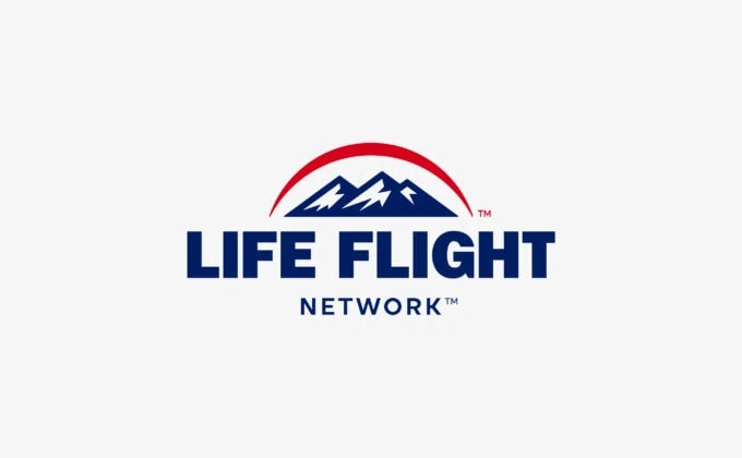 Life Flight Network Trademark
  Life Flight Network Icon
 OVO has been a valuable Life Flight Network partner for nearly four years. They are a pleasure to work with and their expertise in brand management, market research, marketing, and website development has been extremely valuable to our organization’s re-branding and customer targeting efforts. Their professionalism, attention to detail, and responsiveness have made them an integral part of the Life Flight Network marketing team.

Maintenance Check: Consistency in Every Brand Deployment
Brand guidelines are an integral resource for every brand owner, practitioner, and partner. It’s a checklist of sorts in accurate and consistent use of all the components that make up a brand — from its underpinnings to the messaging deployed and its graphic elements; often the most visible markers of the brand name and what it represents. For Life Flight Network, these standards are grounded in its promise. Which in turn, directs its flight path. And they enable the air medical provider to communicate according to its unique position in the market. It answers the brand’s basic questions: How do I, as an employer or a partner, quickly describe what we do and how we do it? How does Life Flight Network convey our personality to someone just getting to know us? Or more tactically; Where do I find an approved logo file? For Life Flight Network, the Brand Guidelines deliver on these questions and so many more.
 Brand Standards
 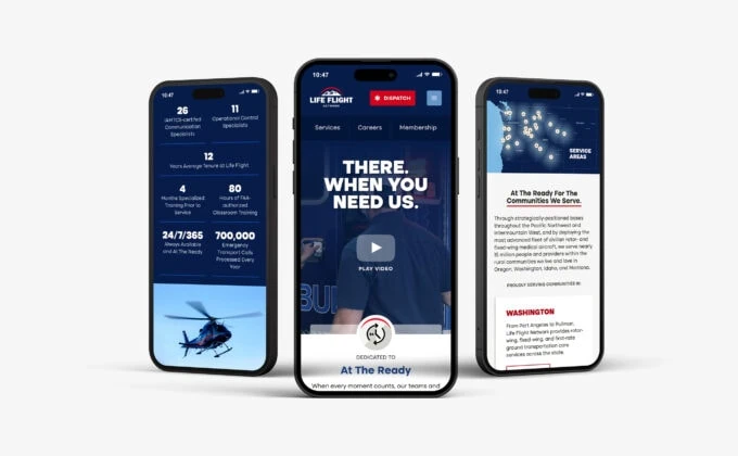 Responsive Website and Development
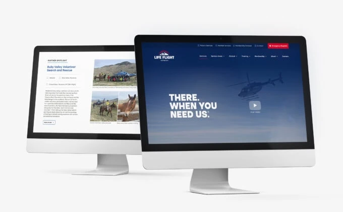
An effective visual identity shows itself in many forms, and every element making up the Life Flight Network system are as boldly reflected in each aircraft as throughout the many tools used in its flight. Be it a uniform, a recycled duffle bag, or the super graphics found in a conference room or at an industry conference, OVO designed solutions that were direct, active, contemporary, and clean. It’s a visual system built to respond and to evolve. To be readily applied across a range of environments and executions. We at OVO look forward to seeing this partnership continue to flourish well into the future. And we can hardly wait.
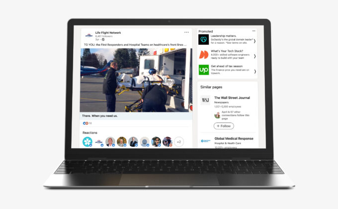
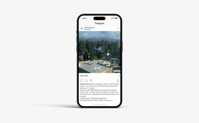 Thank You Social Media Campaign